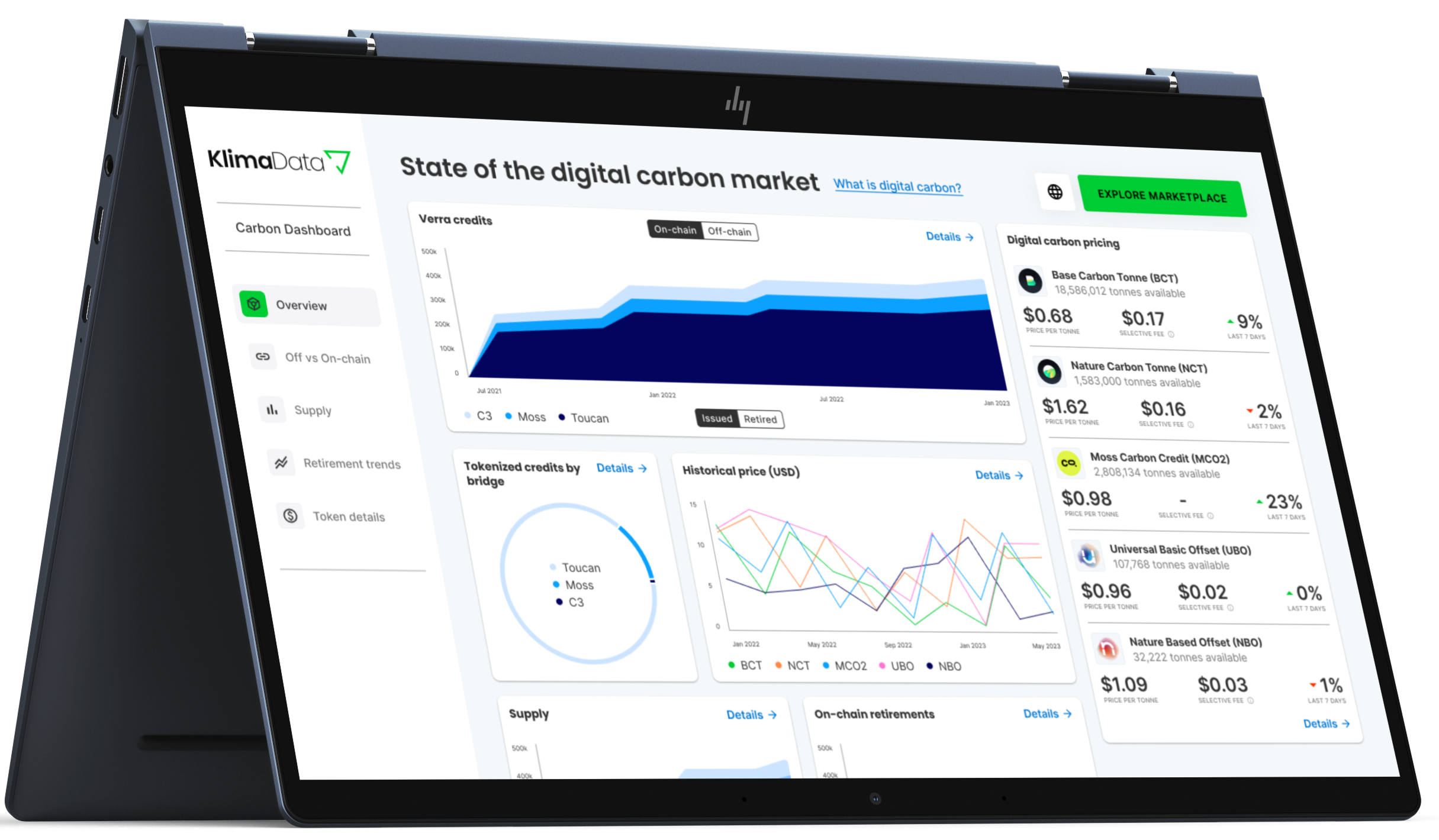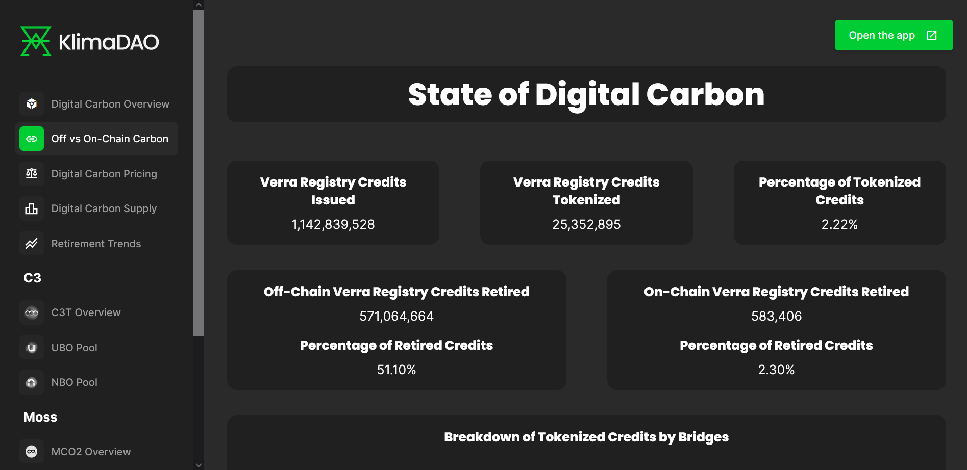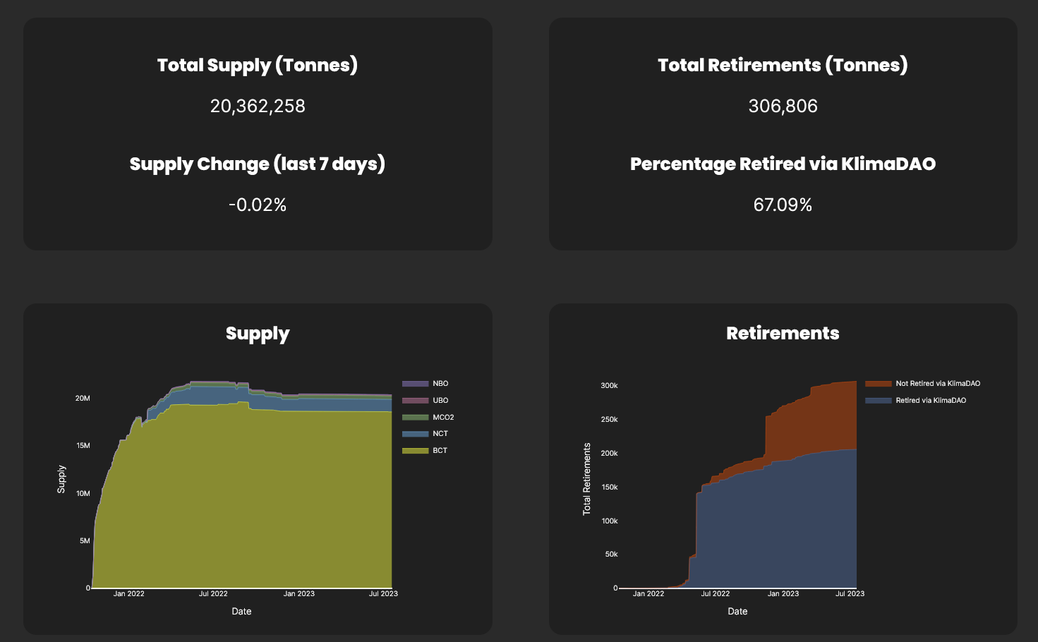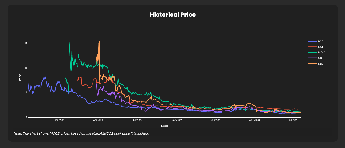
Quick Facts
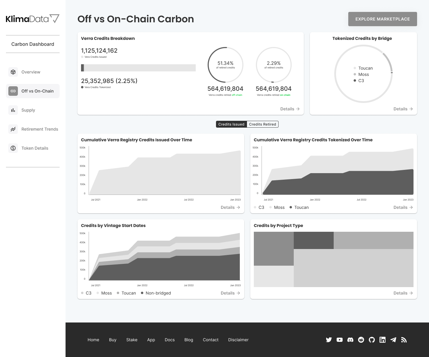
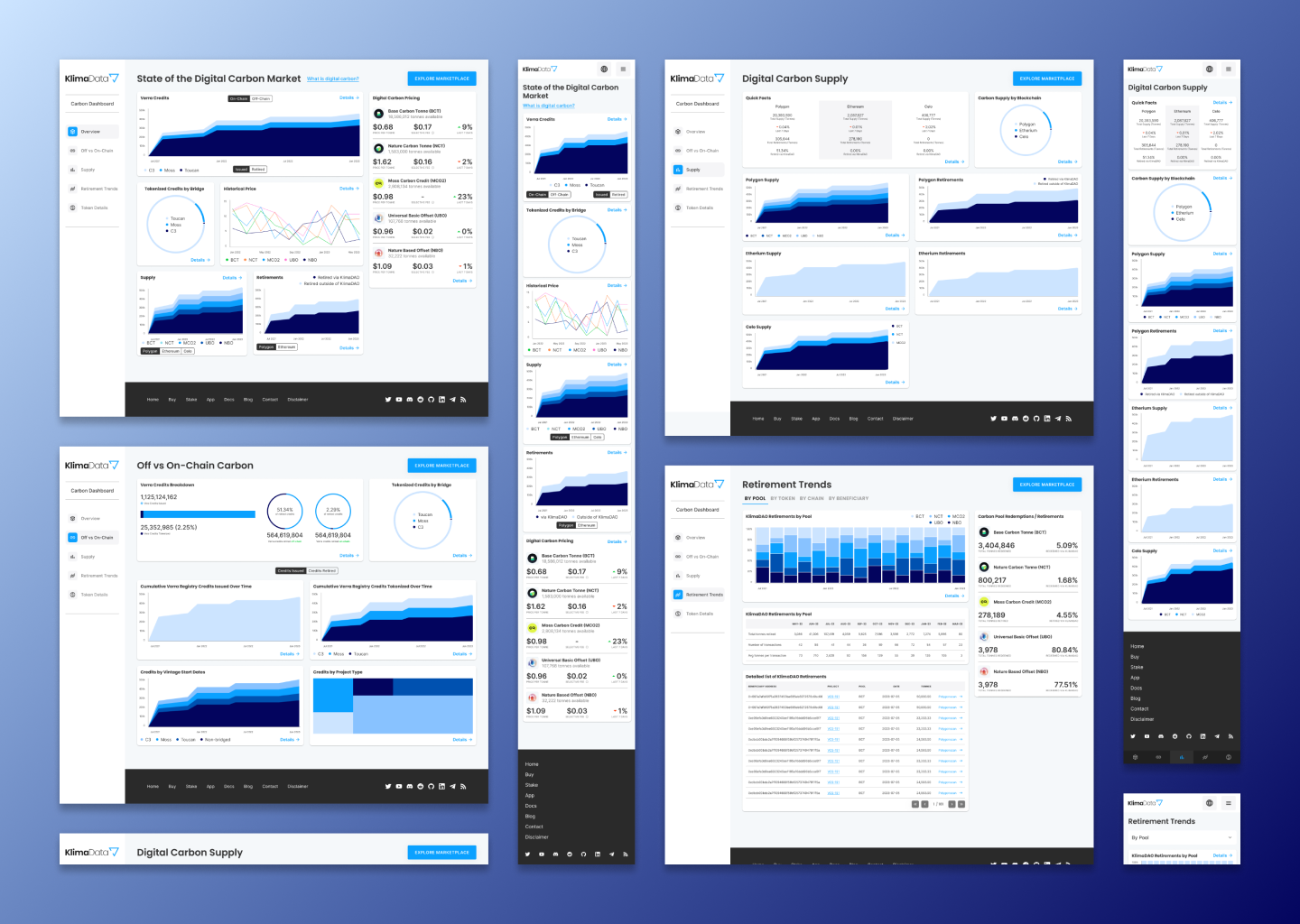
- The original dashboard had solid data coverage but suffered from poor organization, redundancy, and lack of meaningful context, making it harder for users to extract insights.
- User interviews revealed that graphs felt visually weak and repetitive, and users struggled to quickly find or interpret the most relevant information.
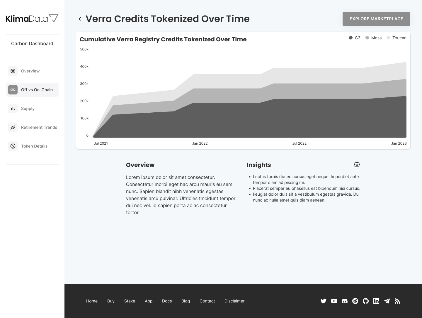
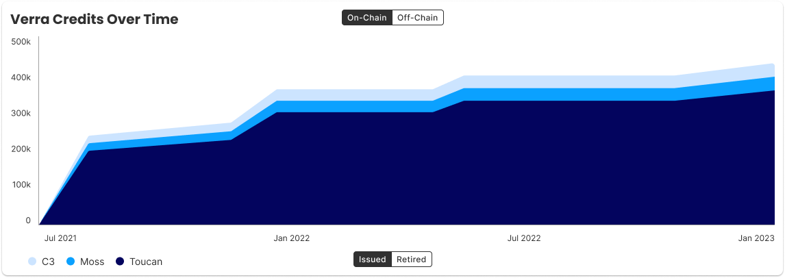
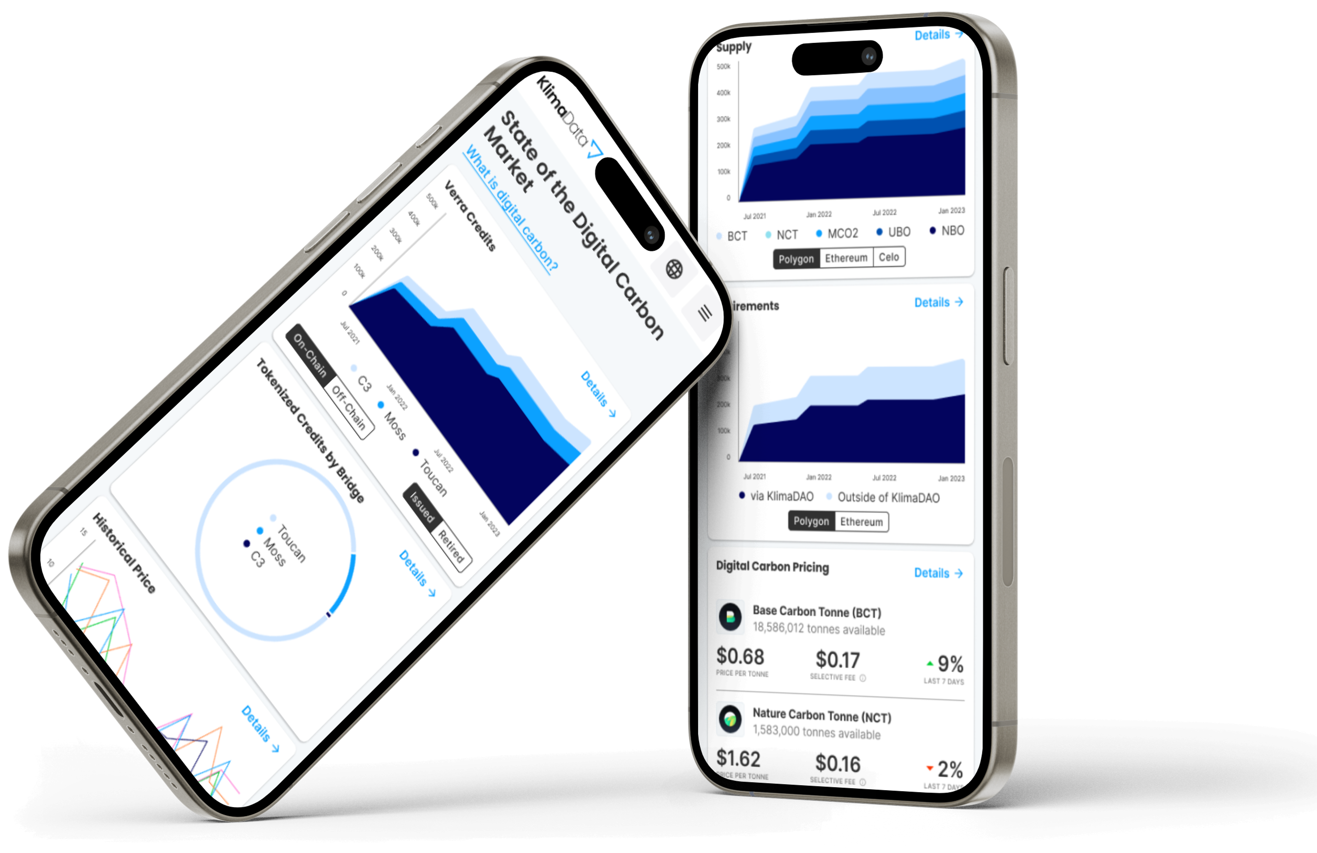
- I redesigned the experience by consolidating data, improving visual hierarchy, and introducing more interactive graph components for deeper exploration.
- I introduced AI-generated insights alongside charts, helping transform raw data into actionable, easy-to-understand analysis.
- Through usability testing, I refined key interaction patterns (like legend placement and comparison views), resulting in a more intuitive, accessible, and insight-driven dashboard experience.